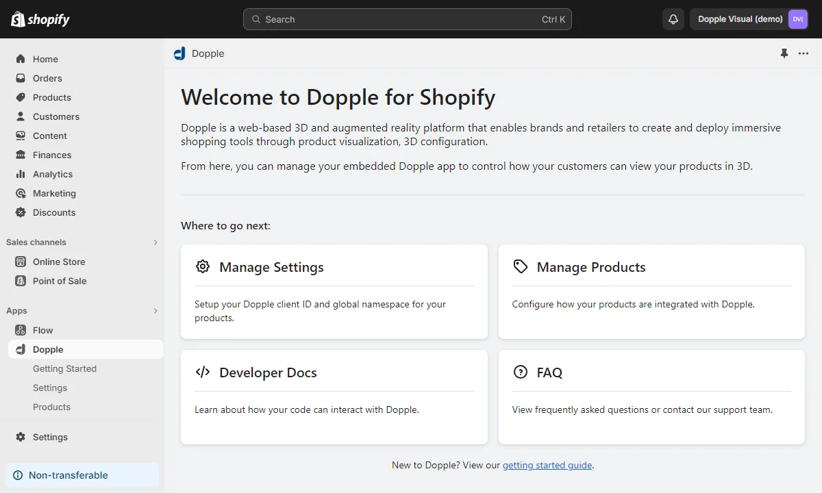
Shopify Integration Guide
Adding 3D to a Shopify site benefits brands and buyers alike, creating a more immersive and confident shopping experience while driving stronger business results.
Dopple Visual is designed to seamlessly integrate with your Shopify site and enables buyers to view selections in real-time through high fidelity 3D and augmented reality. Additional features such as Snapshot, personalization, and product animation further enhance the experience.
This guide describes how to embed Dopple Visual in a Shopify store.
Prerequisites
Section titled “Prerequisites”Before getting started, make sure the following prerequisites are met:
- Your Shopify store is using a compliant theme: a store with at least an Online Store 2.0 theme.
- Your Shopify store’s domain (e.g.
www.your-website.com) has been authorized by Dopple. - You have a valid client ID, product name, and product namespace ready for use.
- You know the configuration properties and values available on your 3D product (typically found in your product’s configurability matrix from Dopple).
- You have at least one product created in your Shopify store.
Installation
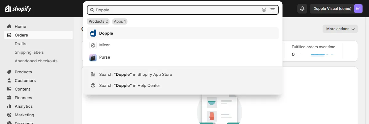
Section titled “Installation”First, visit apps.shopify.com/dopple-visual to install the Dopple app on your store. After installation, you can access the app using the search bar at the top of your store’s admin screen.
Configuring the app
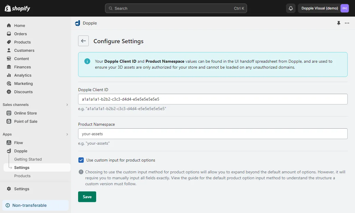
Section titled “Configuring the app”From the app’s home screen, go to Manage Settings and enter your Dopple client ID and the default namespace to use for your 3D products.
Next, check the “Use custom inputs for product options” if your product’s variants are configured using another app instead of within Shopify’s default product variant settings (such as an app to add more variants via metafields), or if you plan to build your page’s UI and configuration logic manually.
-
Leaving this box unchecked will allow the Dopple app to automatically detect your product variants from your default Shopify product’s settings, letting you more easily map those variants to their 3D properties and values.
-
Checking this box will require you to manually enter the names and categories for your variants, along with their corresponding 3D properties and values, but will allow you to create an unlimited number of variants.
The final steps will be broken into two sections according to your choice above:
- Default integration — if the “Use custom inputs for product options” setting is NOT checked.
- Custom integration — if the “Use custom inputs for product options” setting IS checked.
Setting up your product
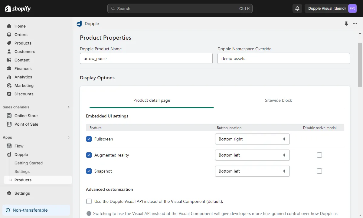
Section titled “Setting up your product”Regardless of which integration method you choose, you will always be able to configure your product’s 3D settings within the Manage Products section of the Dopple app.
Select the product you want to configure, and enter the name and optional namespace override for your product.
The settings under the Display Options section can be used to customize the final output of the embedded 3D product. Here, you can decide which Embedded UI features to enable (only available when using the Visual Component, not the Visual API).
Default integration
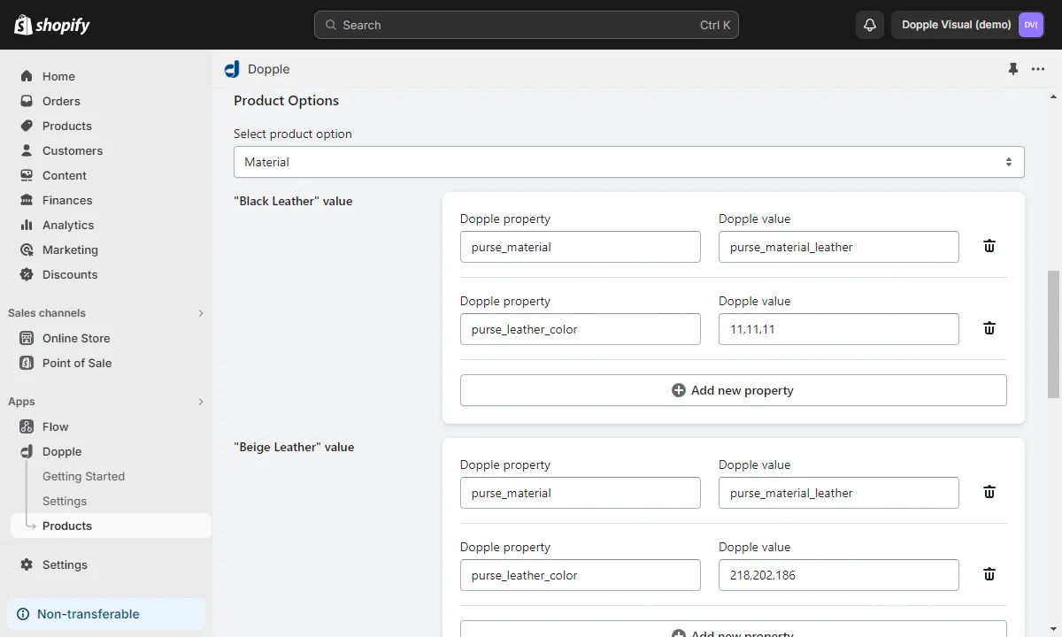
Section titled “Default integration”With the “Use custom inputs for product options” setting unchecked in your Dopple settings, navigate to the Manage Products section of the Dopple app and select your product.
With the default integration, the Dopple app will automatically detect which variants and categories are already configured on your Shopify product, so you only need to enter the Dopple properties and values associated with each variant.
Custom integration
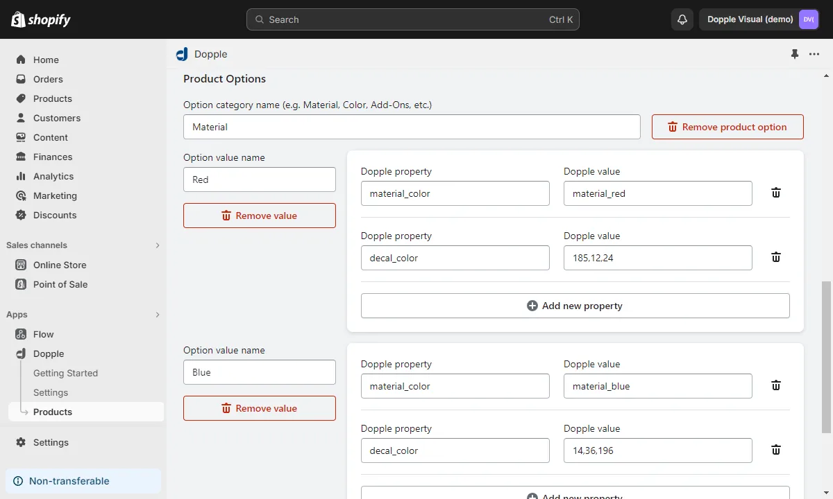
Section titled “Custom integration”With the “Use custom inputs for product options” setting checked in your Dopple settings, navigate to the Manage Products section of the Dopple app and select your product.
- Under the Product Options section, click “Add new product option” to create a category for your product’s variants.
- Enter a name for the first category of variants, such as “Colors” or “Materials” (any name of your choice will do).
- Click “Add new value mapping to product option” to begin adding variants and their corresponding 3D properties and values under this category.
- Enter a display name for the first variant, such as “Black” or “Red” (again, any name of your choice will work, as long as it is unique within this category).
- Add the 3D properties and values for your product to the “Dopple property” and “Dopple value” fields.
Adding Dopple to your site pages
Section titled “Adding Dopple to your site pages”From your Shopify store’s dashboard, navigate to Online Store > Themes > Customize to begin adding Dopple content blocks to pages on your site.
In the Sections panel, click either the “Add block” or “Add section” buttons, then click the “Apps” tab to choose your app block.
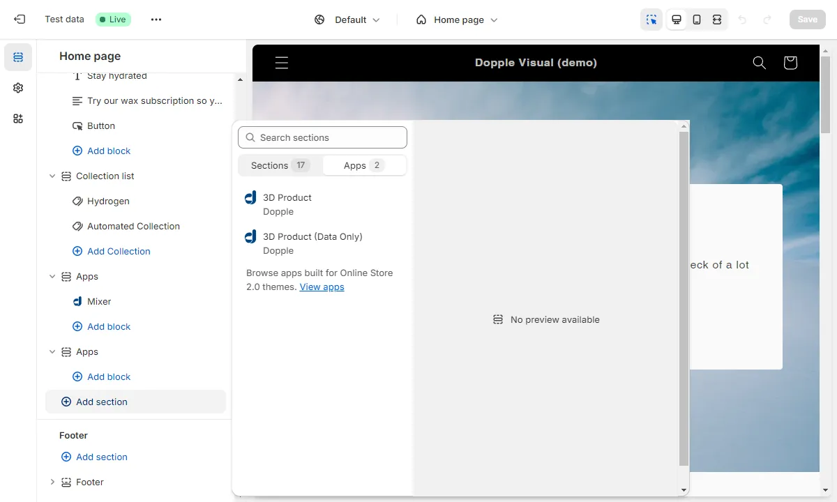
Currently, there are two types of app blocks available for non-product pages:
- 3D Product — This will embed the 3D product on your page using either the Visual Component or a
<canvas>element with the Visual API, along with adding thewindow.doppleShopifyobject to the global scope. - 3D Product (Data Only) — Use this block if you only want to expose the
window.doppleShopifyobject to your page but not use the app’s default Dopple embed. This is useful for more customized themes and pages, where you need access to the product data when building your own custom UI for the 3D products.
After adding an app block to your page, select which product to embed.
The window.doppleShopify object
Section titled “The window.doppleShopify object”When the Dopple app is active on one of your store’s pages, the window.doppleShopify object will be available in the global scope. This object contains all information about the current 3D product along with some additional Dopple-related data (such as which Embedded UI features you have enabled).
Properties
Section titled “Properties”clientId: Your Dopple client ID.namespace: The default global namespace set for your products.customAttributes:trueif your product is set to use custom attributes.productConfig: The product configuration object.doppleProductName: The product name.doppleProductNamespaceOverride: The product namespace override (if one was set).productPageOptions: The product page options object.visualApiEnabled: Whether or not to use the Visual API (if set totrue) or the Visual Component (if set tofalse).mediaPosition: The media position.embeddedUI: The embedded UI object, with information on which Embedded UI features (such as AR, Fullscreen mode, and Snapshots) are enabled.
sitewideBlockOptions: The sitewide block options object.visualApiEnabled:trueif the Visual API is enabled (implies using the Visual Component iffalse).embeddedUI: The embedded UI object, with information on which Embedded UI features (such as AR, Fullscreen mode, and Snapshots) are enabled.
doppleAttributeMap: The product attribute map.
Working with the attribute map
Section titled “Working with the attribute map”The doppleAttributeMap object can be especially handy when following the custom integration steps above, allowing you to easily access the entire map of properties and values available on your 3D products.
For example, this:
// This will display the map of properties and values available on your 3D productconsole.log(window.doppleShopify.productConfig.doppleAttributeMap)Will display an object like this in your console:
"doppleAttributeMap": [ { "attribute": "Category Title (e.g. Colors)", "valueMapping": [ { "value": "Variant #1 - Black", "doppleValue": "11,11,11", "id": "386c184c-e412-4307-b9b8-44bd5bb00e6b", "doppleProperty": "material_color" }, { "value": "Variant #1 - Black", "doppleValue": "metal", "id": "935fffb3-d90c-4195-b4db-60594d751ab0", "doppleProperty": "material_type" }, { "value": "Variant #2 - Red", "doppleValue": "220,10,28", "id": "4ffaa98f-8acb-4b1b-a015-20a821e53db2", "doppleProperty": "material_color" }, // etc... ] }]