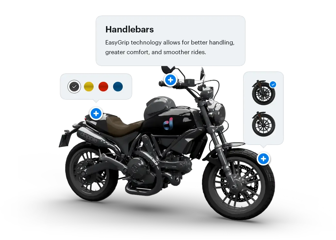
Hotspots
Hotspots provide a way to show annotations or “points of interest” on top of the 3D product, which follow an [X,Y,Z] coordinate in the 3D scene and can be fully controlled and customized in your pages HTML.
These hotspots are useful for showing additional information about a product, and can even contain interactive elements such as color swatches and buttons to configure that part of the product.
API reference
Creating a new hotspot
Section titled “Creating a new hotspot”Once a hotspot is created on your product within the Dopple app, you will be able to access its data on your site via the hotspot property on the product instance.
// Create the product instance when first initializing Dopple Visual on your pageconst myProduct = new Atlatl.Product(template)
// Get the array of hotspots available on the productconst hotspotData = myProduct.hotspots
In this example above, the hotspotData array contains objects with the following properties:
name- A unique name/ID given to the hotspot.position- The [X,Y,Z] coordinates of the hotspot on the user’s screen (X and Y are horizontal and vertical offsets respectively; Z indicates depth and can be used for setting the elementsz-index).visible-trueif the hotspot is currently visible, orfalseif it is occluded by another mesh or out of view of the camera.position3D- The [X,Y,Z] coordinates of the hotspot in the 3D scene.
// console.log(hotspotData) yields the following[ { "name": "foo", "position": [123, 234, 345], "visible": true, "position3D": [0.2, -0.6, -0.3] }, { "name": "bar", "position": [12, 456, 1234], "visible": false, "position3D": [0.1, 0.7, -0.4] }, // etc...]Adding content to your hotspots
Section titled “Adding content to your hotspots”The content for each hotspot (such as text, images, buttons, etc.) is defined in your pages HTML, and will be positioned on top of your <canvas> or Visual Component.
<canvas id="dopple-visual"></canvas><div id="hotspot-foo"> <h2>My Hotspot #1</h2> <p>This is some text that will be displayed on top of the 3D product.</p></div>As a best practice, it is ideal to place the hotspots as sibling elements to the <canvas> element, and have a parent container element with position: relative; set on it. This will allow the hotspots to be positioned correctly on top of the 3D product during the final step later.
<div style="position: relative;"> <canvas id="dopple-visual"></canvas> <!-- Hotspot #1 --> <div id="hotspot-foo"> <h2>My Hotspot</h2> <p>This is some text that will be displayed on top of the 3D product.</p> </div> <!-- Hotspot #2 --> <div id="hotspot-bar"> <h2>My Hotspot #2</h2> <p><img src="/path/to/some/image.png" /></p> </div> <!-- Hotspot #3 --> <div id="hotspot-baz"> <h2>My Hotspot #3</h2> <button>Click me</button> </div> <!-- etc... --></div>Attaching hotspot elements to the 3D product
Section titled “Attaching hotspot elements to the 3D product”Each hotspot in the array of hotspots on the product comes with an attach() method. This method accepts two parameters:
- An HTML element (required)
- An options object (optional)
HTML element
Section titled “HTML element”The first parameter is an HTML element that will be “attached” to the hotspot and will be positioned and displayed without the need for any manual logic or calculations.
<div id="hotspot-foo"> <h2>My Hotspot</h2></div>const hotspotElement = document.getElementById('hotspot-foo')myProduct.hotspots[0].attach(hotspotElement)Once attached, the hotspot element will automatically update its left and top positions to follow the hotspot within the 3D scene as it rotates and moves.
Options object
Section titled “Options object”The second parameter is an optional options object that can be used to customize the behavior of the hotspot element.
const options = {    autoPosition: true,    autoShow: false}
myProduct.hotspots[0].attach(hotspotElement, options)autoPosition(boolean) — have the attached elementstransformproperty automatically updated to match the hotspots position.autoShow(boolean) — have the attached element automatically shown when the hotspot is visible, and hidden when the hotspot is not visible.
Listening for the visibilitychange event
Section titled “Listening for the visibilitychange event”An element that is attached to a hotspot can listen to the visibilitychange event (by using addEventListener) to detect when the hotspots visible property has been toggled. This property will be true when the hotspot is in view of the camera, and false when it is either occluded by another mesh or out of view of the camera.
This is especially useful for adding or removing a visibility class on the hotspot element once the hotspot goes out of view.
hotspot.addEventListener('visibilitychange', (event) => { if (event.detail.visible) { hotspotElement.classList.add('hotspot--visible') } else { hotspotElement.classList.remove('hotspot--visible') }})Building a full hotspot component
Section titled “Building a full hotspot component”Using the concepts above, we can create a hotspot component for a real world use case:
- Create a stylized dot for the hotspot itself.
- Create a content box that pops up when the dot is clicked.
- Hide the hotspots until the 3D product has finished loading.
The component’s markup
Section titled “The component’s markup”To help ensure the hotspot and its content are fully accessible, we will use a hidden checkbox input to control whether or not the hotspot content is currently visible, and control the appearance of the hotspots dot.
The main hotspot component itself will wrap everything — the dot, the hotspot content, and the hidden checkbox controlling the hotspot content — inside of a containing <div>:
<div class="hotspot" id="hotspot-example"> <input id="hotspot-checkbox" type="checkbox" /> <label class="hotspot-dot" for="hotspot-checkbox"> <svg viewBox="0 0 24 24"> <line x1="12" y1="8" x2="12" y2="16" /> <line x1="8" y1="12" x2="16" y2="12" /> </svg> </label> <div class="hotspot-content"> <p>I'm a hotspot!</p> </div></div>By using a <label> for the hotspot dot with a for attribute matching the id on the checkbox input, the dot will toggle the checkbox when clicked.
Attaching the component to the product
Section titled “Attaching the component to the product”After initializing the product on your page, use the hotspots attach() method to automatically attach the hotspot element to the hotspots position:
const hotspotElement = document.getElementById('hotspot-example')
myProduct.hotspots[0].attach(hotspotElement)
hotspotElement.addEventListener('visibilitychange', (event) => {    if (event.detail.visible) {        hotspotElement.classList.remove('hotspot--hidden')    } else {        hotspotElement.classList.add('hotspot--hidden')    }})
Showing the component once the product has loaded
Section titled “Showing the component once the product has loaded”To prevent users from accidentally seeing hotspots or interacting with their content before the product is ready, we can hide any hotspots while the page is still loading, then show them once the 3D product is ready.
// Hide the hotspot component(s) while the page loadsdocument.querySelectorAll('.hotspot').forEach((hotspot) => {    hotspot.style.display = 'none'})
// Initialize Dopple Visual and load the product once the document is readywindow.addEventListener('load', async () => {
    // *** Include any initial logic for loading your product here first ***
    // Wait until the product is fully loaded and ready    await myProduct.ready()
    // Hide the loading screen    visual.loadingScreen.hide()
// Show the hotspot component(s) once the product is ready document.querySelectorAll('.hotspot').forEach((hotspot) => { hotspot.removeAttribute('style') })})Styling the component
Section titled “Styling the component”More detailed explanations are included in the comments below, but the main idea is to visually hide the hotspots checkbox (while still keeping it accessible to keyboard users), then style the dot and hotspot content according to the checkboxs checked state.
/* The container element for the hotspot component */.hotspot {    height: 0;    position: relative;    transition: all 33ms ease; /* Add a slight bit of easing to reduce jittery motion */    width: 0;    z-index: 2; /* Give the hotspot a z-index greater than the canvas' z-index */}
/* Visually hide the checkbox input while keeping it keyboard accessible */.hotspot input[type='checkbox'] {  border: 0 !important;  clip: rect(0, 0, 0, 0) !important;  height: 1px !important;  margin: -1px !important;  overflow: hidden !important;  padding: 0 !important;  position: absolute !important;  white-space: nowrap !important;  width: 1px !important;}
/* The visible dot for the hotspot */.hotspot-dot {    align-items: center;    background: #007BEE;    border-radius: 1rem;    box-shadow: 0 0.125rem 0.5rem rgba(0, 0, 0, 0.25);    color: #FFF;    content: "+"; /* Optional: show a character such as a + or • within the dot */    cursor: pointer;    display: flex;    height: 1.5rem;    justify-content: center;    margin: 0;    padding: 0;    position: absolute;    transform: translate(-50%, -50%); /* Center the dot within the hotspot */    transition: all 300ms cubic-bezier(0.06, 0.8, 0.2, 1);    user-select: none;    width: 1.5rem;}
/* Enlarge the hotspot when hovered or focused */.hotspot-dot:hover,.hotspot input[type='checkbox']:focus-visible ~ .hotspot-dot {    transform: translate(-50%, -50%) scale(1.15);}
/* Give the hotspot a subtle outline when focused */.hotspot input[type='checkbox']:focus-visible ~ .hotspot-dot {    outline: 4px solid rgba(0, 128, 234, 0.25);}
.hotspot-dot svg {    fill: none;    height: 1.5rem;    stroke: currentColor;    stroke-linecap: round;    stroke-linejoin: round;    stroke-width: 2;    width: 1.5rem;}
.hotspot-content {    background: #FFF;    border-radius: 0.625rem;    bottom: calc(100% + 1.5rem); /* Slightly offset the hotspot content from the dot */    box-shadow: 0 0.25rem 0.75rem rgba(0, 0, 0, 0.2);    left: 50%;    padding: 1rem;    pointer-events: none; /* Initially prevent any mouse events on the content when inactive */    position: absolute;    opacity: 0; /* Initially hide the hotspot when inactive */    transform: translate(-50%, 0) scale(0.75); /* Center the hotspot and initially shrink it when inactive */    transform-origin: bottom center;    transition: all 350ms cubic-bezier(0.06, 0.8, 0.2, 1);    visibility: hidden; /* Initially hide the hotspot when inactive */    width: 15rem;}
/* Add the small triangle to the bottom of the hotspot content */.hotspot-content::after {    border: solid 0.5rem transparent;    border-top-color: #FFF;    bottom: -0.875rem;    content: '';    display: block;    left: 50%;    position: absolute;    transform: translate(-50%, 0);}
/* Show the hotspot content when active */.hotspot input[type='checkbox']:checked ~ .hotspot-content {    opacity: 1;    pointer-events: auto;    transform: translate(-50%, 0);    visibility: visible;}
/* Change the dot's background when active */.hotspot input[type='checkbox']:checked ~ .hotspot-dot {    background: #EF5493;}
Full code example
Section titled “Full code example”<html lang="en"> <head> <meta charset="utf-8"> <title>My Page</title> <!-- Link to the Visual Component's scripts --> <script src="https://builds.dopple.io/atlatl-visual-api/releases/current/index.js" defer></script> <!-- Custom scripts --> <script src="scripts.js" defer></script> <!-- Custom styles --> <link rel="stylesheet" href="styles.css" /> </head> <body> <div class="canvas-container"> <!-- Canvas to render the 3D scene to --> <canvas id="my-canvas"></canvas> <!-- Hotspot #1 --> <div class="hotspot" id="hotspot-1"> <input id="hotspot-1-checkbox" type="checkbox" /> <label class="hotspot-dot" for="hotspot-1-checkbox"> <svg viewBox="0 0 24 24"> <line x1="12" y1="8" x2="12" y2="16" /> <line x1="8" y1="12" x2="16" y2="12" /> </svg> </label> <div class="hotspot-content"> <p>First hotspot content.</p> </div> </div> <!-- Hotspot #2 --> <div class="hotspot" id="hotspot-2"> <input id="hotspot-2-checkbox" type="checkbox" /> <label class="hotspot-dot" for="hotspot-2-checkbox"> <svg viewBox="0 0 24 24"> <line x1="12" y1="8" x2="12" y2="16" /> <line x1="8" y1="12" x2="16" y2="12" /> </svg> </label> <div class="hotspot-content"> <p>Second hotspot content.</p> </div> </div> </div> </body></html>.canvas-container { height: 540px; position: relative; width: 960px;}
#my-canvas { height: 100%; width: 100%;}
.hotspot { height: 0; opacity: 0; /* Hide the hotspot until it comes into view */ position: relative; transition: all 33ms ease; /* Add a slight bit of easing to reduce jittery motion */ visibility: hidden; /* Hide the hotspot until it comes into view */ width: 0; z-index: 2; /* Give the hotspot a z-index greater than the canvas' z-index */}
/* Show the hotspot when it comes into view */.hotspot--visible { opacity: 1; visibility: visible;}
/* Visually hide the checkbox input while keeping it keyboard accessible */.hotspot input[type='checkbox'] { border: 0 !important; clip: rect(0, 0, 0, 0) !important; height: 1px !important; margin: -1px !important; overflow: hidden !important; padding: 0 !important; position: absolute !important; white-space: nowrap !important; width: 1px !important;}
/* The visible dot for the hotspot */.hotspot-dot { align-items: center; background: #007BEE; border-radius: 1rem; box-shadow: 0 0.125rem 0.5rem rgba(0, 0, 0, 0.25); color: #FFF; content: "+"; /* Optional: show a character such as a + or • within the dot */ cursor: pointer; display: flex; height: 1.5rem; justify-content: center; margin: 0; padding: 0; position: absolute; transform: translate(-50%, -50%); /* Center the dot within the hotspot */ transition: all 300ms cubic-bezier(0.06, 0.8, 0.2, 1); user-select: none; width: 1.5rem;}
/* Enlarge the hotspot when hovered or focused */.hotspot-dot:hover,.hotspot input[type='checkbox']:focus-visible ~ .hotspot-dot { transform: translate(-50%, -50%) scale(1.15);}
/* Give the hotspot a subtle outline when focused */.hotspot input[type='checkbox']:focus-visible ~ .hotspot-dot { outline: 4px solid rgba(0, 128, 234, 0.25);}
.hotspot-dot svg { fill: none; height: 1.5rem; stroke: currentColor; stroke-linecap: round; stroke-linejoin: round; stroke-width: 2; width: 1.5rem;}
.hotspot-content { background: #FFF; border-radius: 0.625rem; bottom: calc(100% + 1.5rem); /* Slightly offset the hotspot content from the dot */ box-shadow: 0 0.25rem 0.75rem rgba(0, 0, 0, 0.2); left: 50%; padding: 1rem; pointer-events: none; /* Initially prevent any mouse events on the content when inactive */ position: absolute; opacity: 0; /* Initially hide the hotspot when inactive */ transform: translate(-50%, 0) scale(0.75); /* Center the hotspot and initially shrink it when inactive */ transform-origin: bottom center; transition: all 350ms cubic-bezier(0.06, 0.8, 0.2, 1); visibility: hidden; /* Initially hide the hotspot when inactive */ width: 15rem;}
/* Add the small triangle to the bottom of the hotspot content */.hotspot-content::after { border: solid 0.5rem transparent; border-top-color: #FFF; bottom: -0.875rem; content: ''; display: block; left: 50%; position: absolute; transform: translate(-50%, 0);}
/* Show the hotspot content when active */.hotspot input[type='checkbox']:checked ~ .hotspot-content { opacity: 1; pointer-events: auto; transform: translate(-50%, 0); visibility: visible;}
/* Change the dot's background when active */.hotspot input[type='checkbox']:checked ~ .hotspot-dot { background: #EF5493;}// Hide the hotspot component(s) while the page loadsdocument.querySelectorAll('.hotspot').forEach((hotspot) => { hotspot.style.display = 'none'})
// Initialize some global variables for the Visual instancelet visual;let myProduct;let namespace = 'my-product-namespace';let name = 'my-product-name';
// Initialize Dopple Visual when the document loadswindow.addEventListener('load', async () => {
// Initialize the Visual instance on the page's canvas const renderCanvas = document.getElementById('my-canvas') visual = new Atlatl.Visual(renderCanvas)
// Replace with your client ID here await visual.initClient('a1a1a1a1-b2b2-c3c3-d4d4-e5e5e5e5e5e5')
// Create and load the ProductTemplate const template = new Atlatl.ProductTemplate(visual, namespace, name) await template.load()
// Create the Product instance myProduct = new Atlatl.Product(template) await myProduct.ready()
// Hide the loading screen to show the product once the product is ready visual.loadingScreen.hide()
document.querySelectorAll('.hotspot').forEach((hotspot, i) => { // Show the hotspot component(s) once the product is ready hotspot.removeAttribute('style')
// Attach the hotspot myProduct.hotspots[i].attach(hotspot)
// Listen for the visibilitychange event hotspot.addEventListener('visibilitychange', (event) => { if (event.detail.visible) { event.target.classList.add('hotspot--visible') } else { event.target.classList.remove('hotspot--visible') } }) })})